
What do you do when you have dated finishes you can't tear out? Here's how to work around them and give your space a lift on a budget.
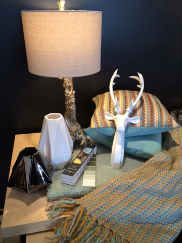
Looking at the picture above, what did you notice first? The sculptural deer head? The vases? The lamp? The toss cushions? The throw? What about the dated, 1980s seafoam carpet?
Yup, it's there, but it probably isn't where your eye when first. I am going to share with you the formula to work around a challenging colour in your space. I am using the example of flooring and seafoam as the colour, but the same ideas could be applied to just about any element in your home you'd rather not have as centre stage.

Take a look at the colour wheel. You probably remember these from when you were a kid, but maybe didn't know what to do with one.
Keeping with our example of the seafoam carpet, it falls on the side of the colour wheel between blue and green. It's basically a soft turquoise. Why do does that matter? Because you want to work with seafoam, turquoise or colours immediately beside it. What you want to avoid at all costs if you want to downplay a colour is anything opposite it on the colour wheel. That means no red (that includes pink), orange (that includes peach), or purple (that includes mauve). Those colours will contrast with the seafoam and visually intensify it. The opposite is true if your carpet is pink (there's a lot of pink and peach carpet still hanging around from the 80s in Calgary homes). If you do not like your peach carpet, do not use blues and greens as accent colours. Remember when a peach and seafoam colour scheme was the bomb? Yup, if you wanted to really show off your hot new peach carpet, the best way to do it was painting your walls seafoam and putting a big picture of Max Headroom over the couch.
OK, now that you have resigned yourself to working with the element you don't like, take one more step and add a bit more of the thing you don't like. What? Why? Because if you want to hide in the jungle, you wear green. This is basic camo training for interior design commandos. You can use a different shade, but you need to add more of that colour, or that thing you hate will be the first thing you or anyone else notices about your room. Do feel free to slightly adjust the colour. Use a greyer, lighter more neutral version on your walls or even a white with a subtle undertone and then use hits of an even more intense version in your accessories. See the toss cushions? I used a deeper, richer shade of the carpet to harmonize, but attract the eye away from the carpet. Ditto with the throw.
Go out and find those accessories that harmonize with and are perhaps even more intense than the flooring you hate, and suddenly, that flooring just isn't as obvious anymore. Find interesting sculptural pieces that capture the eye too. You don't need to overload the room with them so nobody knows what to look at first, but add a few "wow" factor pieces. Most people really aren't that interested in your carpet anyway.
I am not suggesting you will love that less than stellar "feature" if you follow this advice, but you probably won't hate it anymore. You'll probably be a lot happier working with it until you can afford to do the real deal and pull out the seafoam carpet or whatever it is, but remember the other design lesson we have learned here today when you do. For heaven's sake, when you put in your new flooring, choose something neutral and classic. You can do that even if you want your space to feel trendy, but in 10 years you won't be kicking yourself for committing such a bit part of your home design to the "it" colour of the moment. This goes for anything that is a major investment including sofas and chairs. Keep. Them. Neutral.